A quiet design lesson from my laptop’s charging port
Every time I plug in the charging cable of this laptop and my eyes go to that part, I enjoy this practical design. It reminds me almost every week, several times, like a small design lesson, that good design often hides in the ordinary places we stop noticing.
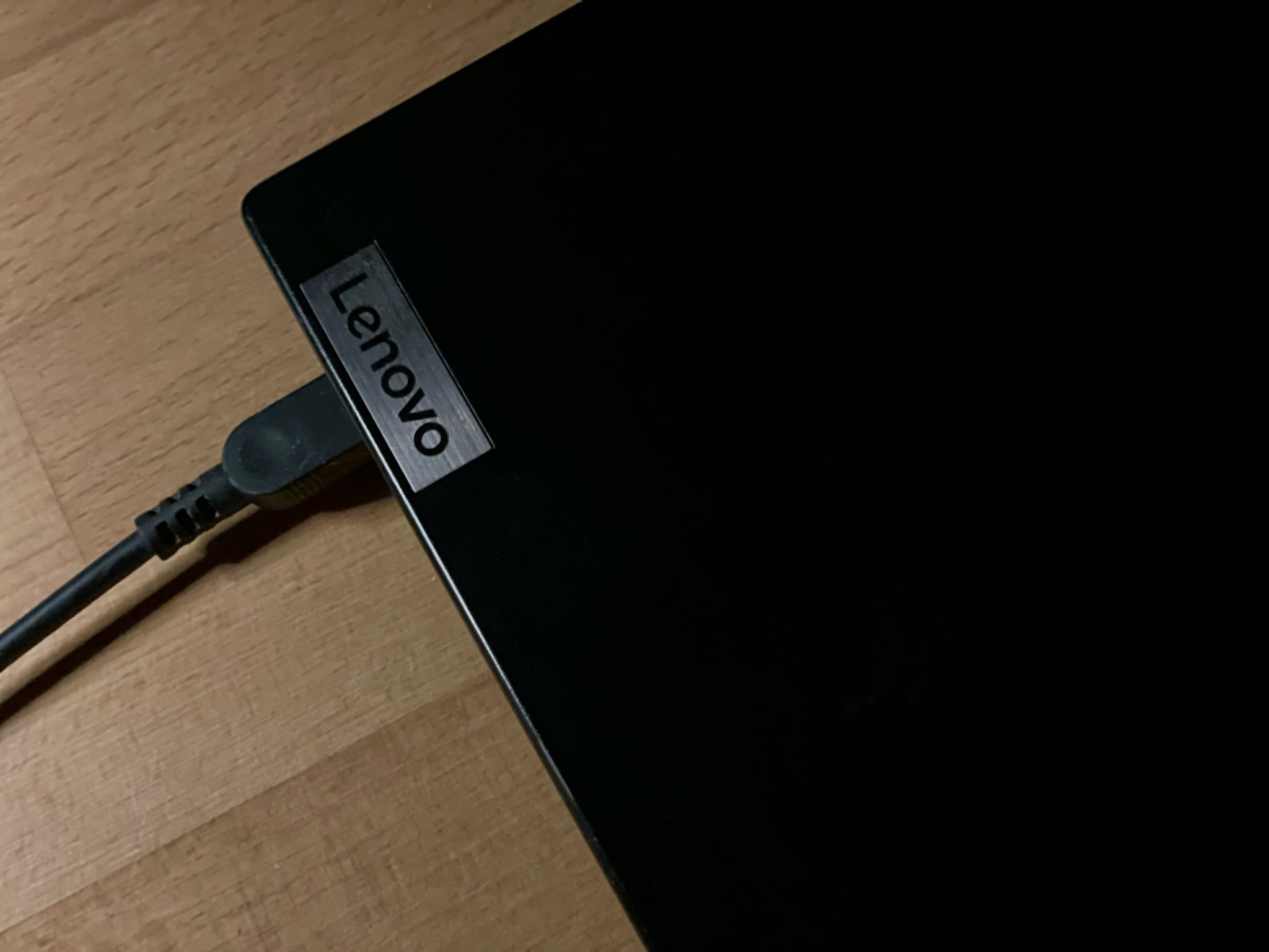
The Lenovo logo sits right where the charging port is. I don’t have to bend down or hunt for the hole. My eyes land on the logo and the cable goes in. In the dark, the little light on the Esc button lines up with the same spot, so the port is exactly where the light is. Nothing dramatic. Just placement that works.

Someone decided the logo could do more than brand the machine. It could also help me find the port without thinking. The light was already there for status. Putting it in line with the port turned it into a guide as well. Two small choices, and the everyday action of charging becomes slightly less annoying.
This is not luck. It follows a few simple design ideas I keep seeing in good products. The logo works as a signifier. Important things should be easy to see and should point you in the right direction. Don Norman called these signifiers. Here the logo quietly says “the port is here.” It also works as a landmark. People remember places by fixed reference points, the way you use a tall building to navigate a city. Once you notice the logo and the light, your hand knows where to go next time. The alignment matters too. Related things that sit on the same line feel connected. Your brain maps them together without effort. That is why the light and the port feel like they belong to the same action. The light itself gives feedback and helps in low light. It tells you the machine is on or charging, and at the same time it shows you where to plug in.
All of this is about ergonomics and discoverability. The design assumes you are tired, in a hurry, or working in the dark, and removes the need to search or bend.
Lenovo has a long habit of caring about these small practical things. The result is a product that feels solid and easy to live with, not just nice to look at. The feeling this creates is called Thoughtful design. Attention to detail. A small usability delight. Intuitive interaction. Landmark-based orientation. At the broader level it is simply user-centered design focused on real use.
I used to think design lessons came from books or carefully crafted objects. Now I get one from a laptop I open every day. Good design is not always loud. Sometimes it is just something you notice only because it makes a routine a little easier, again and again.